Price comparisons
Money Super Market
I reinvented the UX of the product to simplify and focus it on its core values and what's best for its users.

24%
Increase in conversion
1 month
To build and release
2 hats
Product designer and manager

UX Issues
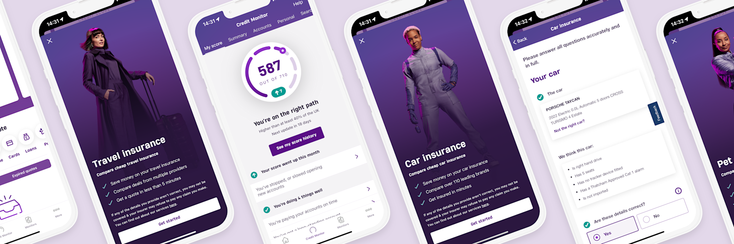
The original Money Super Market app was very confused, it was a long way away from the current app you see here. It had todos, trophies, and more that diverted people's attention away from the flows that generate revenue. I proposed a new UX that would fix these issues.
UX Fixes
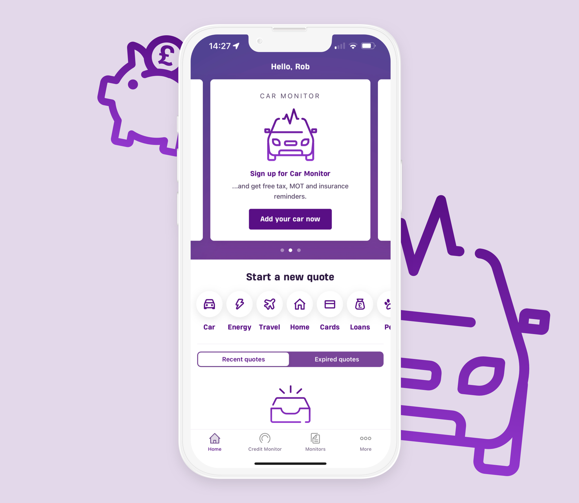
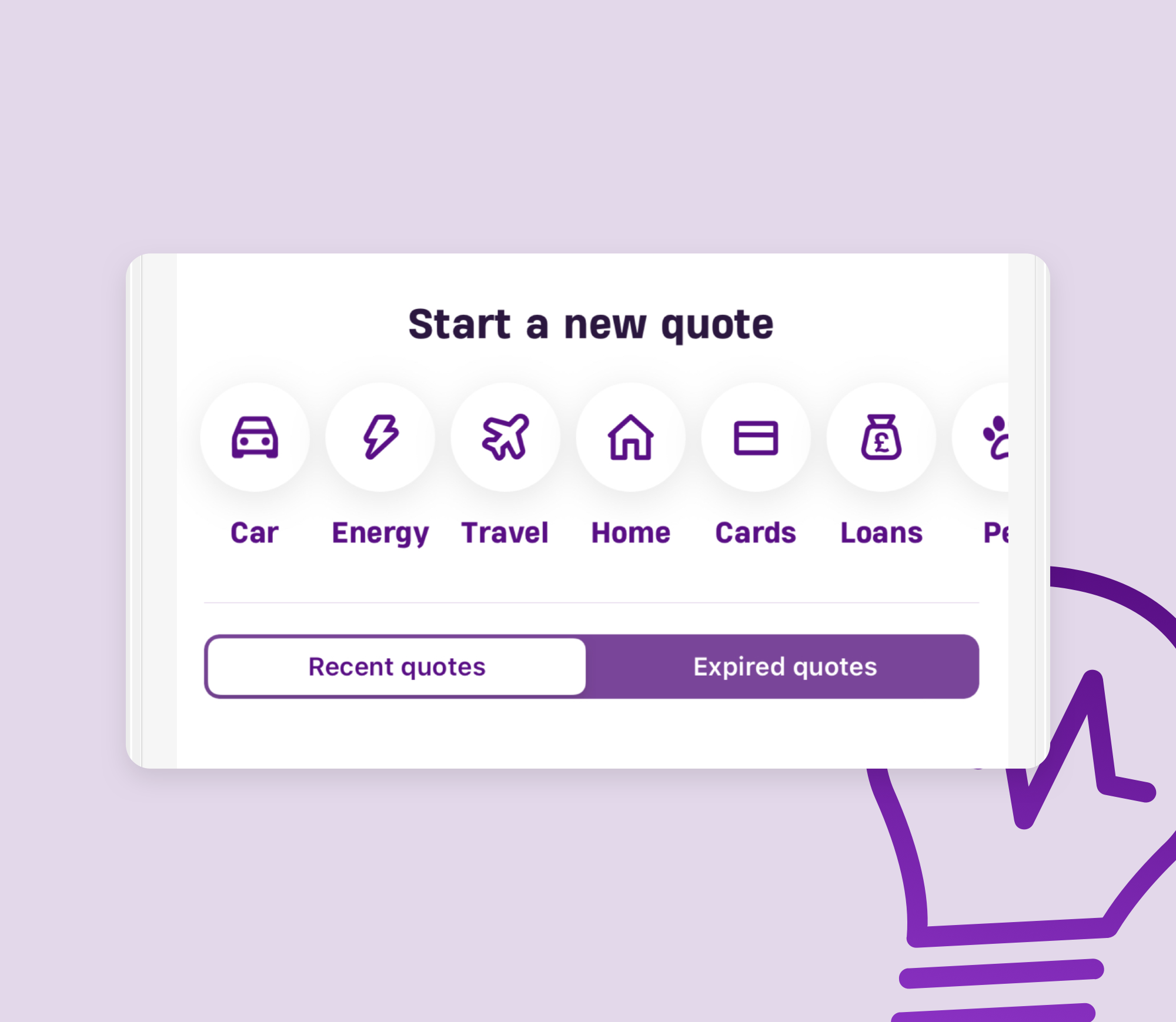
With a small team I lead the design and build of the UX you see here. I simplified the app by removing areas that were not used and creating four buttons; Car, Energy, Travel, and Home, that launched their respective flows. This provoked a 24% increase in conversion and was strong enough that subsequently Money Super Market has added more buttons to highlight other flows.
